Branding/ Logo design/ Packaging Concepts/ Marketing Materials
brief
Sierra Serena is a natural products brand inspired by the lush landscapes of the Sierra Nevada. Rooted in sustainability and holistic well-being, the brand offers handcrafted creams and oils made from locally sourced ingredients. The brand identity was designed to capture the essence of abundance, serenity and the connection to nature.
goal
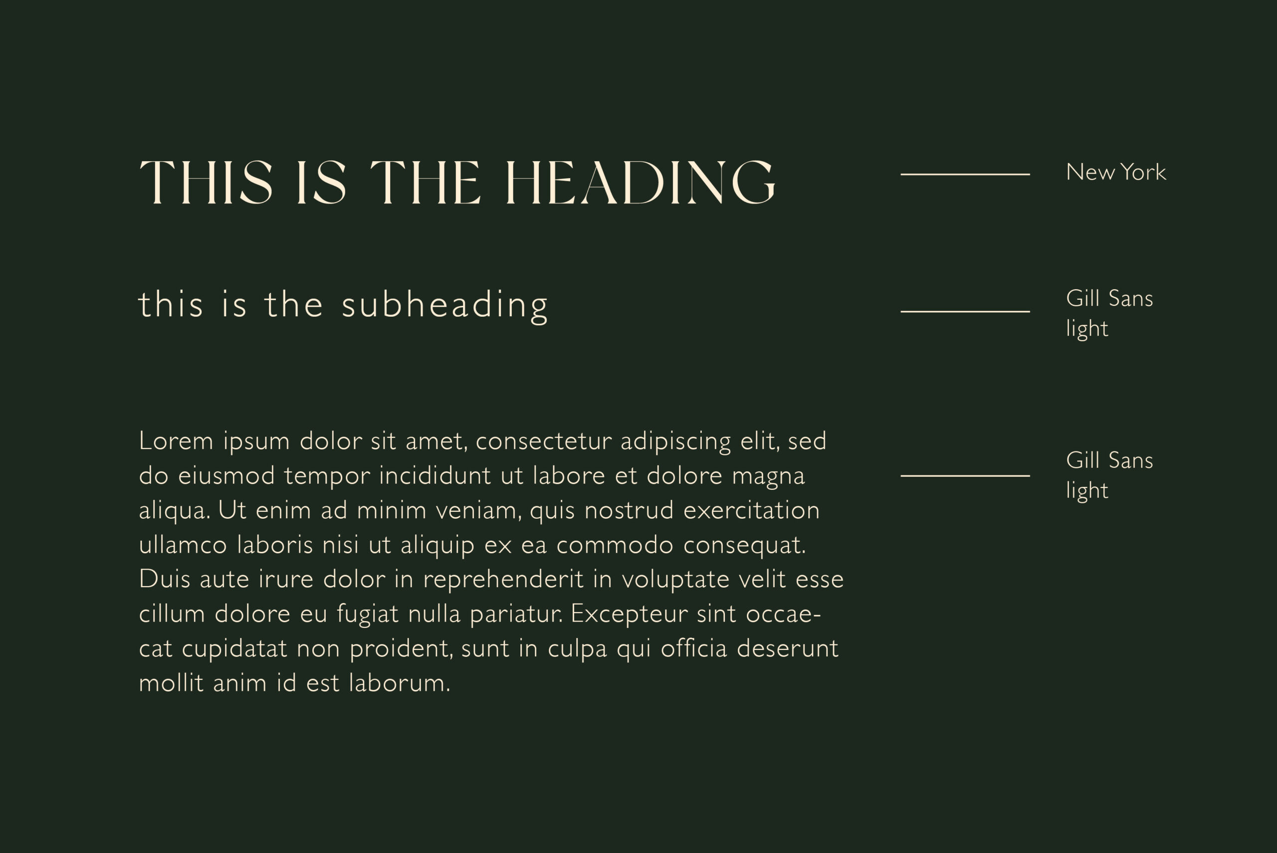
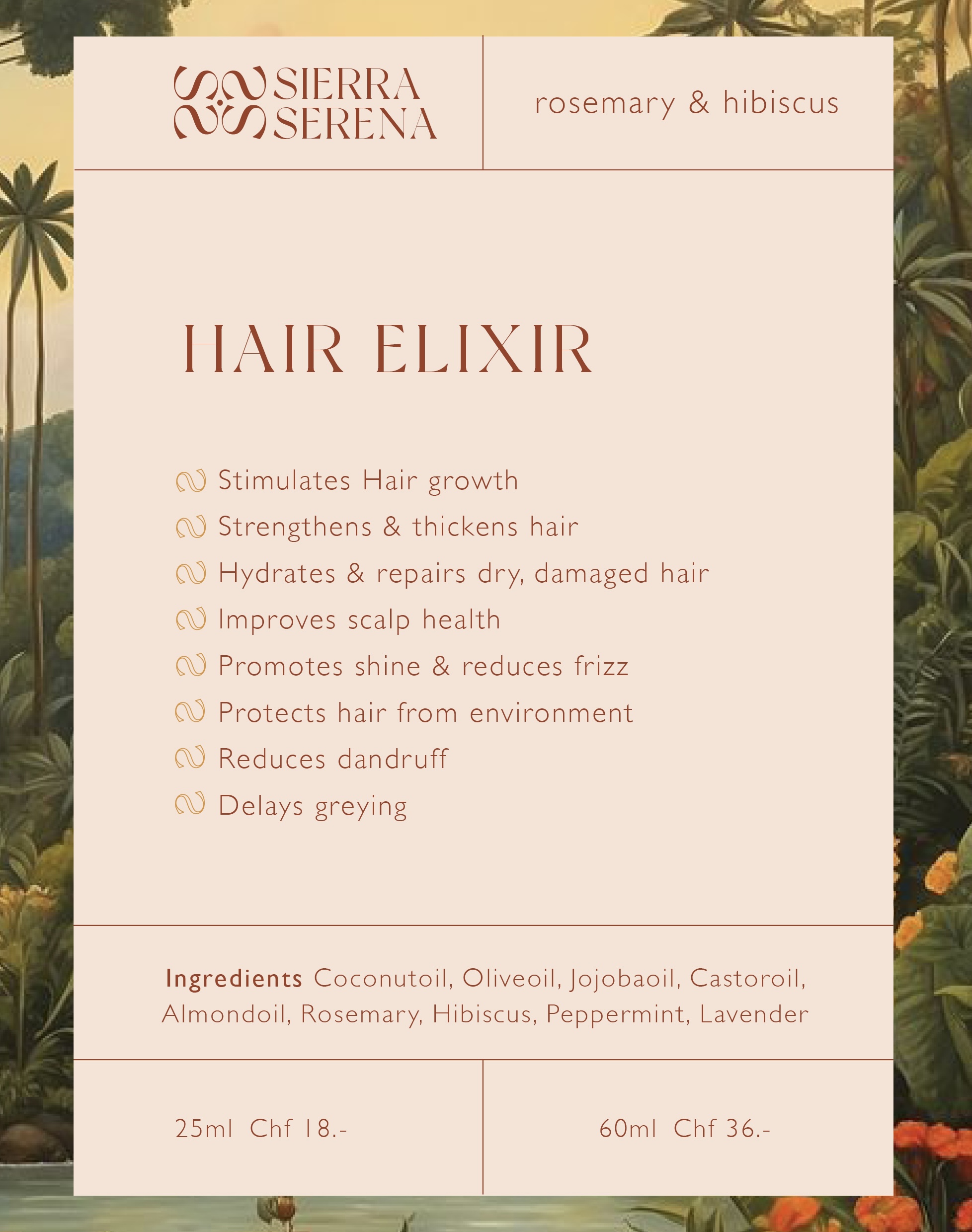
The goal was to create a brand image that radiates the natural and artisanal spirit of Sierra Serena. This included designing a cohesive logo, color palette, typography, and product labels that resonate with eco-conscious consumers and reflect the lush environment of the Sierra Nevada.
challenges
One of the primary challenges was developing a visual language that feels premium and modern yet remains deeply rooted in the authenticity of natural and handmade products. The balance of earthy tones with vibrant accents had to evoke trust and the essence of purity while maintaining a strong shelf presence.
process
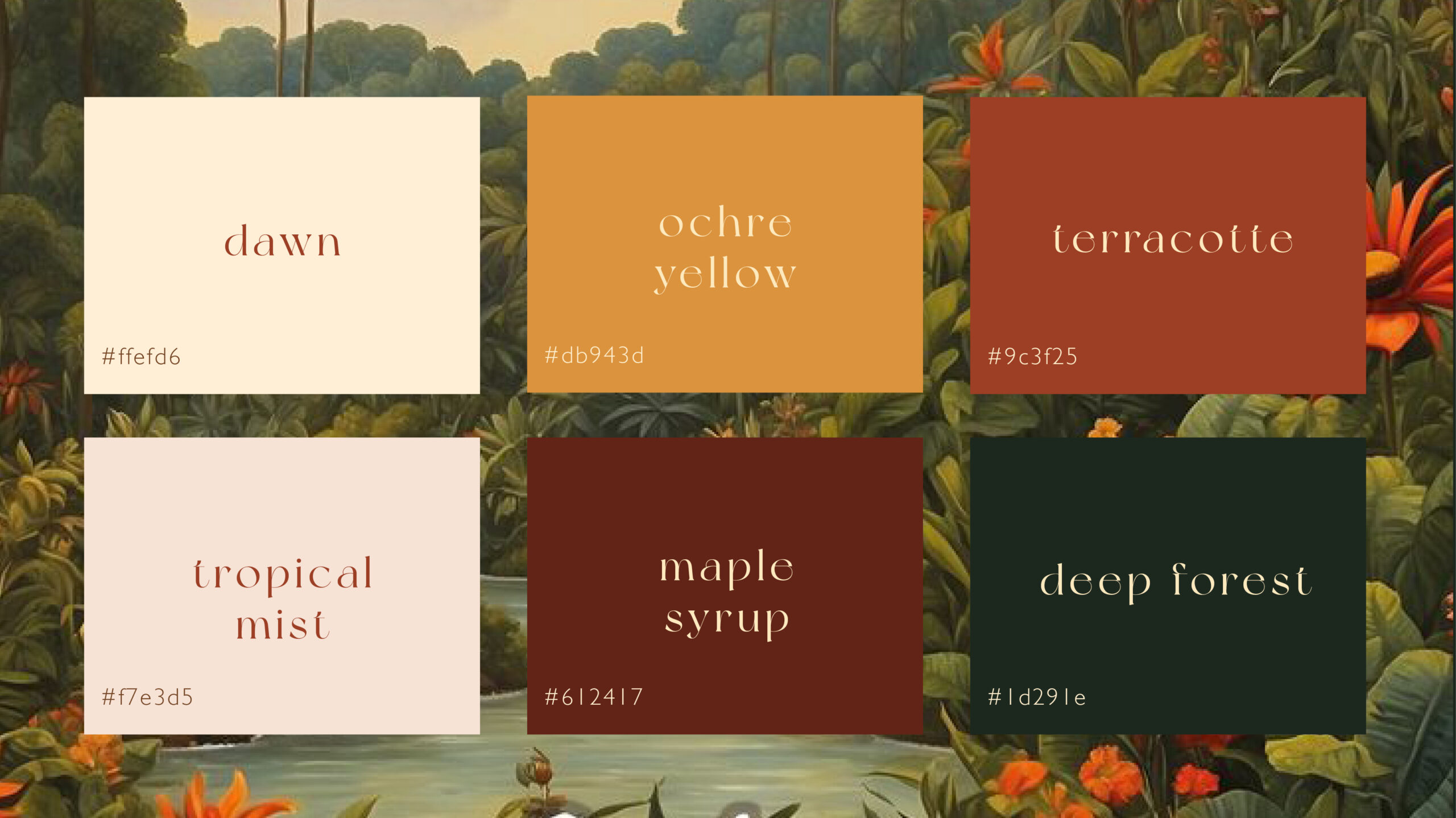
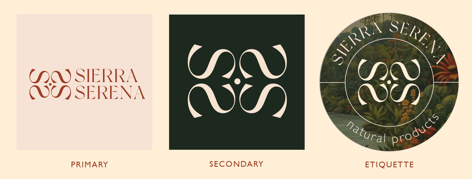
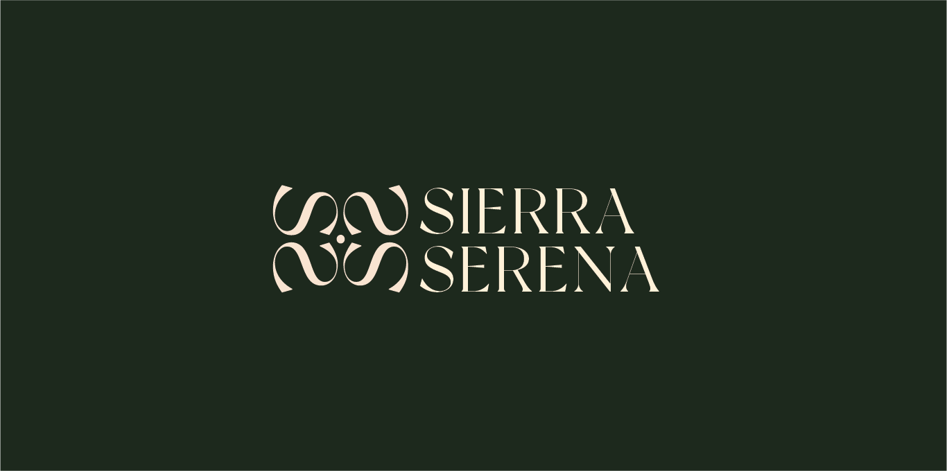
The logo, inspired by the flowing forms of nature, features an elegant yet organic design that mirrors the brand’s ethos. A warm and earthy color palette—ranging from «deep forest» green to «terracotta»—was selected to reflect the rich, tropical origins of the ingredients.
ŚAKTI
previous project
Ancestral Retreats
next project
work with me
Let’s create together,
reach out to me.
Are you ready to embark on a journey of creativity and transformation for your brand? Whether you’re seeking a captivating website, striking visuals, or a complete brand overhaul, I invite you to take the first step.
Your brand’s unique story deserves to be told through innovative design, and I’m here to make that happen.

